J&J Dog Website Redesign
To establish J&J Dog Supplies as an authority in the industry and drive customer conversions, we revamped its online presence with a modern and engaging website. We not only improved user experience but also showcased the brand's unique value proposition and products.
My Role
UX/UI Visual designer from concept to delivery
The Tools
Adobe Photoshop, Adobe Illustrator, Wireframing, Shogun Page Builder
My Key Contributions
Visual Design, Interaction Design, Brand Guidelines, Iconography, Copy Editing, and the Competitive Audit. I also assisted in the development and implementation of the information architecture and Sitemap for the website.
My Responsibilities

Redesign of the visual design of the website for both desktop and mobile functionality from ideation to completion. Competitive audit research on direct and indirect competitors in the e-commerce marketplace. Developer of revised comprehensive brand guidelines and standards. Created a set of guidelines that outline the visual identity, tone of voice, and overall brand personality.
The Opportunity
The initial website was characterized by outdated features, as well as various limitations and issues stemming from its utilization of the Magento platform.
The Idea
In an effort to enhance the website's overall performance and align it with contemporary standards, the company embarked on a mission to revamp the site, focusing on modernizing its functionality, improving its visual appeal, and establishing the brand as a prominent contender within the industry.
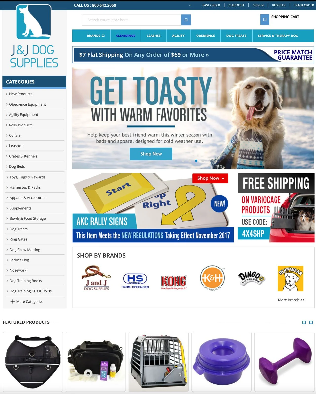
Outdated Magento Design
The Brand/Story
J&J Dog Supplies has been providing high-quality dog training equipment through catalog mail orders and online sales since 1965. Their success is built on offering professional-grade products and exceptional customer service. They are the go-to supplier for hundreds of dog training clubs, schools, and kennels, as well as thousands of individual trainers around the world.
Competitive Research
Analysis
I compiled a list of competitor and client-selected websites that I searched through to find consistent industry themes.
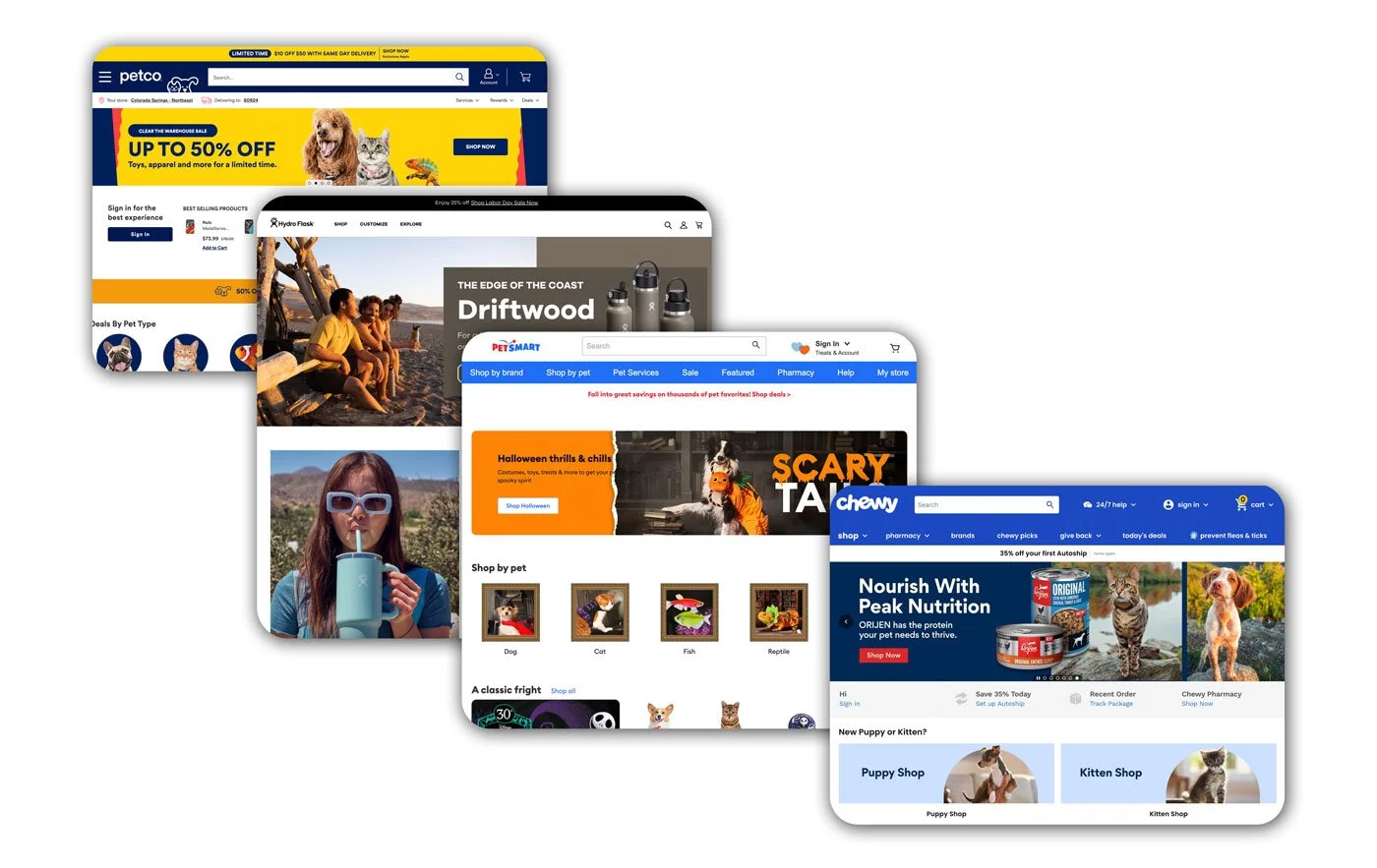
Insight #1
Direct and indirect competitors have cleaner designs above the fold with full-length banners and modern header designs.
Task: Redesign the head to modernize the look and amplify the brand styling so it is no longer generic.
Insight #2
Direct and indirect competitors have a more organized and header-central information architecture for easy access to help the users access a broad range of products.
Task: Review and restructure the information architecture to emphasize and organize the outdated drop-down menus.
Insight #3
Direct and indirect competitors have a brand-directed style and aesthetic for a specific consumer base.
Task: Create a unique sylistic design for a cohesive look and feel across the website and brand.
Style Guide
I created a style guide for the website, creating a specific swatch set from the logo. We used this across the site to keep the brand cohesive and recognizable.
Oswald was chosen for headers because of its bold and strong appearance. With its clean and approachable look, Open Sans was chosen for the body text.
The logo design was already in place and established. It was not changed but only used for reference when creating the style guide.
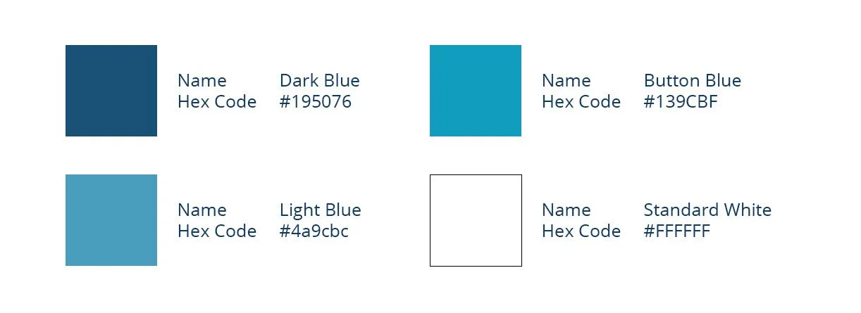
Color Palette
Logo
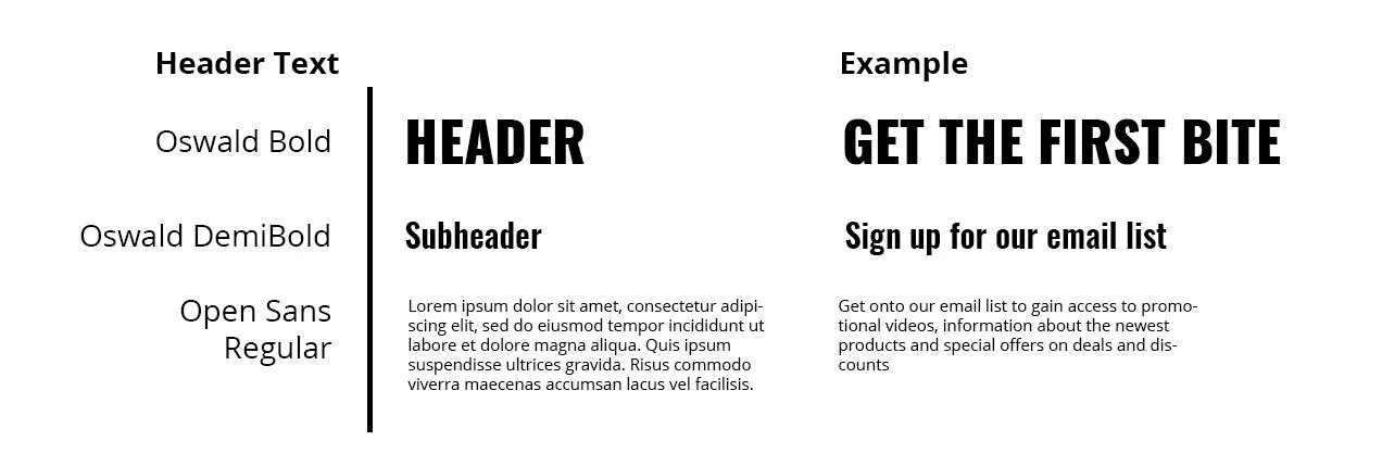
Typography
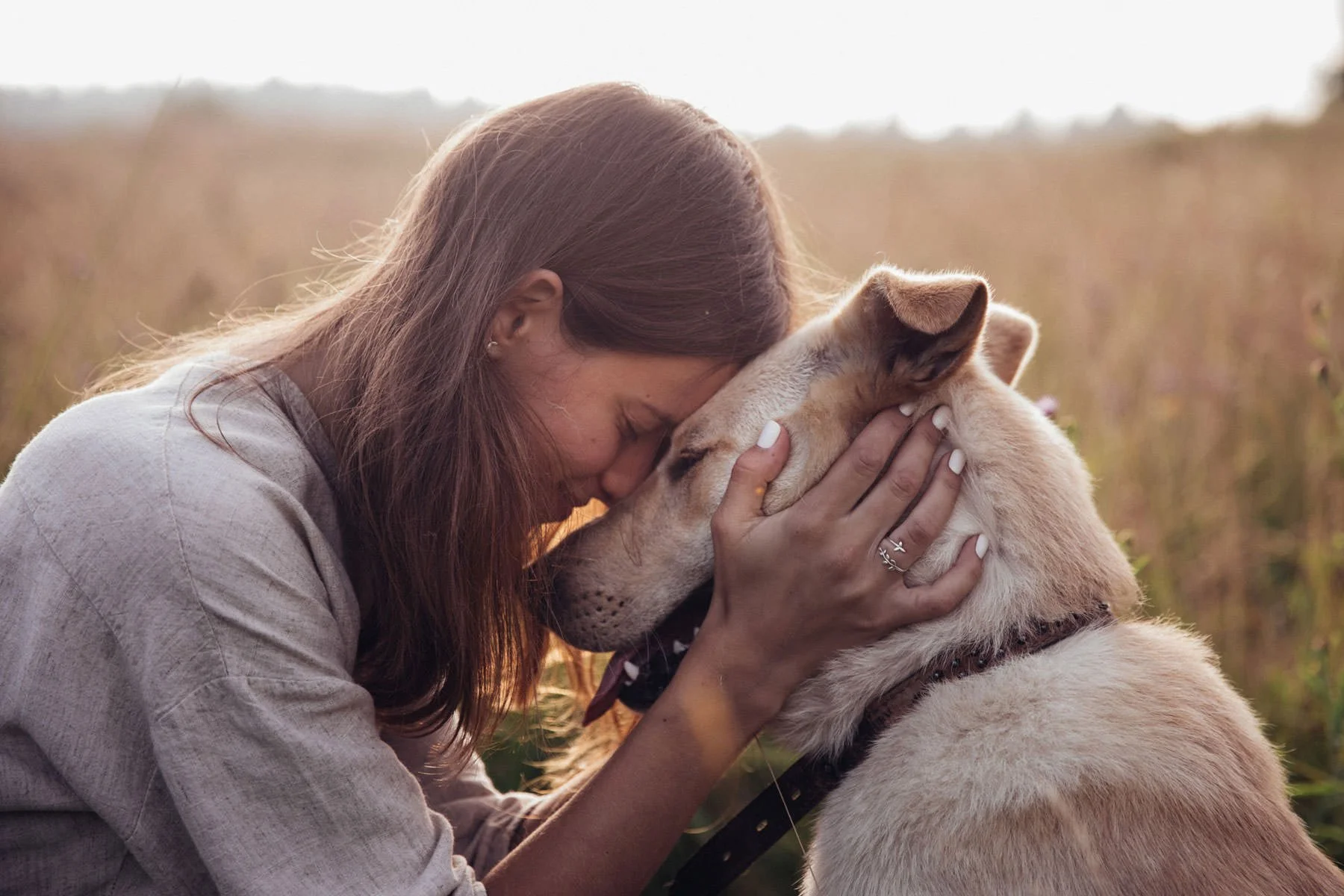
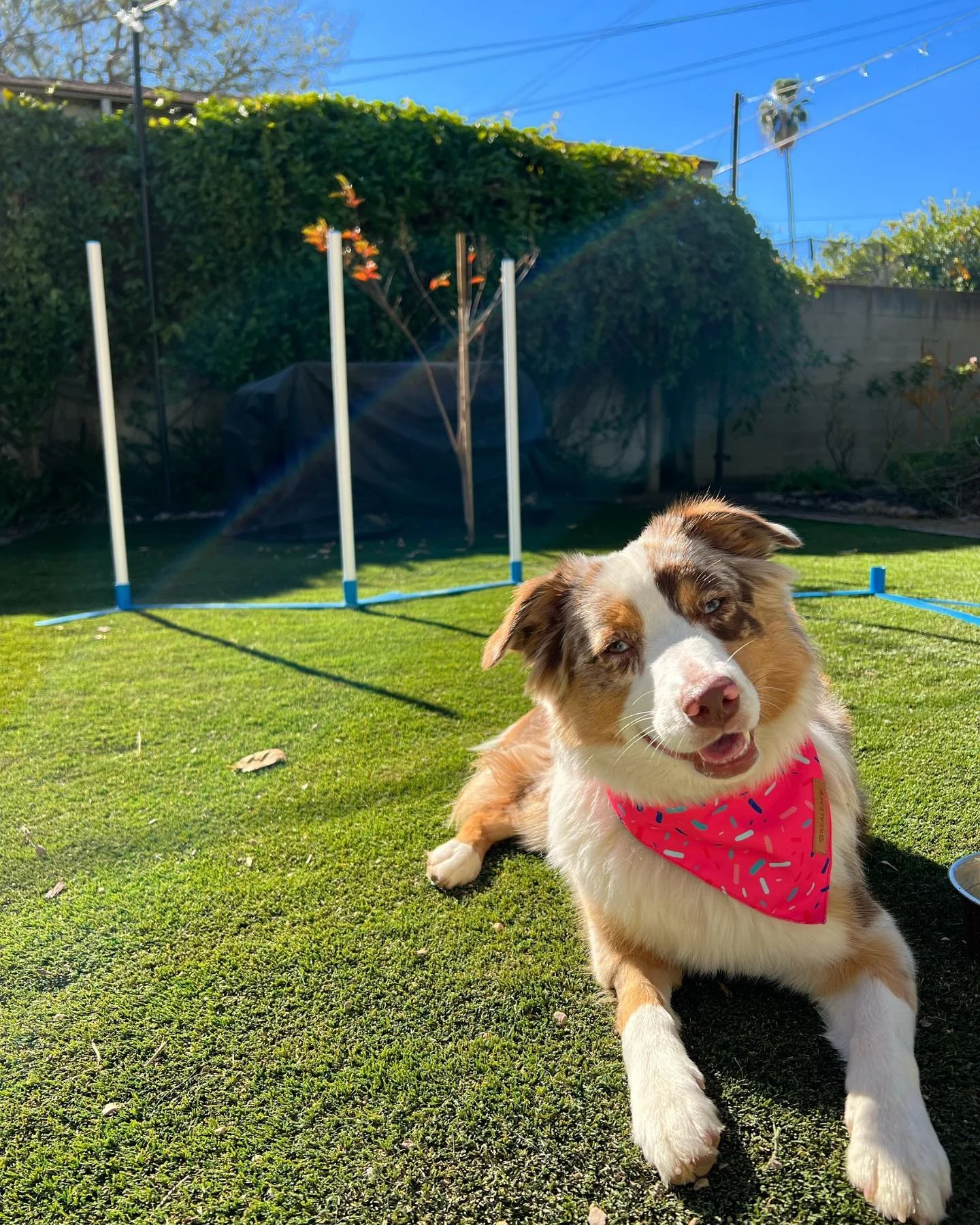
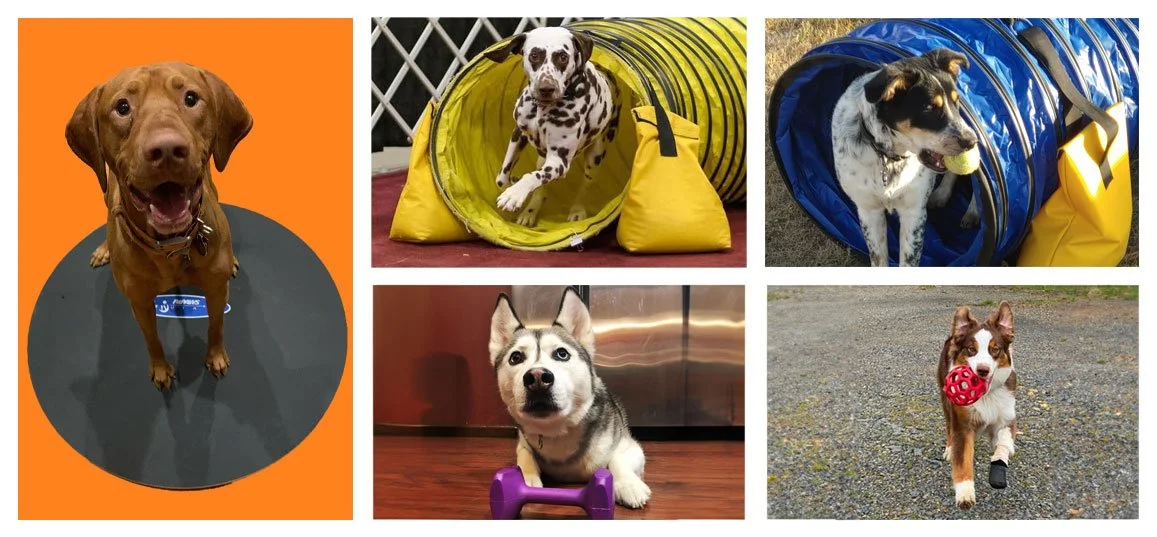
New Brand Imagery
With the redesign in full force, we had a need for new asset photos to go with the new design. The marketing lead built the idea to collect customer-submitted photos as part of a strategy to get customers to send in their photos of their dogs wearing our gear in exchange for rewards points that would add up as discounts towards purchases. Out of hundreds of submissions, we were able to catalog the best images and use them as assets for our website. Alongside the customer submissions, we also had acquired an array of quality images from a photographer as part of a photoshoot we shot for a Service Dog Catalog that we were building the same year.
100+
Submissions
30+
Ideal Photos Used
1+
Weekly time spend editing photos
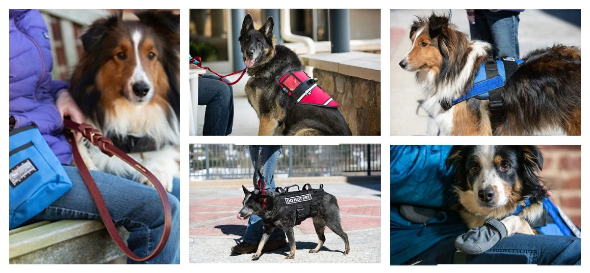
A handful of quality photos acquired from customer submissions
Photography from Service Dog Catalog phoshoot
Hi Fidelity Mockup
With the ideas and assets in place, it was time to build the high fidelity mockup for presentation.
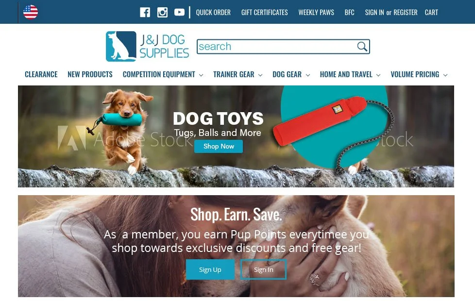

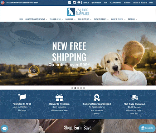
Header section
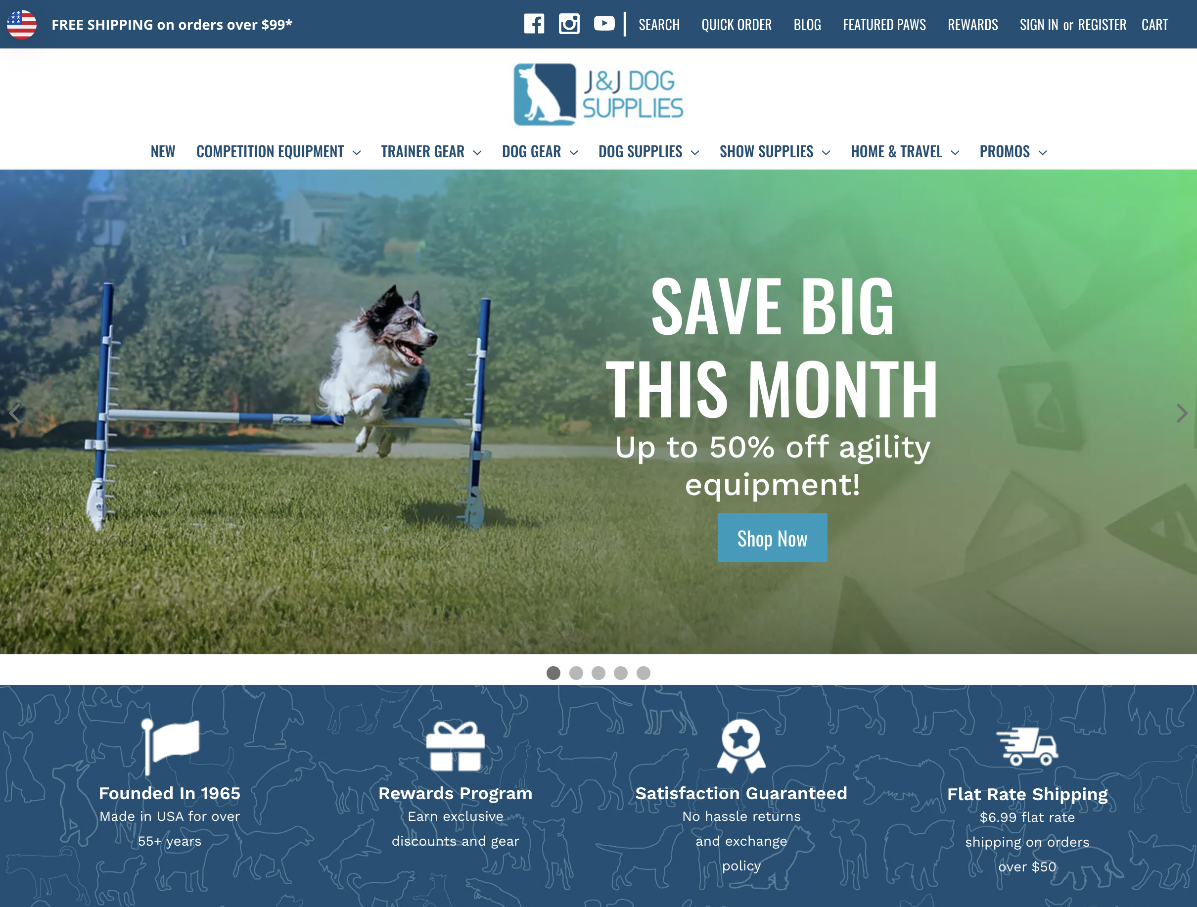
I designed an appealing eye-catching above-the-fold area with a large slider section to highlight our products and define the brand. The header was designed to highlight the logo, clarify the informational architecture, and provide easy-access section buttons to help the visitor navigate the wide variety of products on our page. Just below the hero, I created a section for the rewards program to entice users to exchange their email for rewards like discounts and free products.
Call to Action
The hero is designed to update/change imagery from week to week. In the first slide, as a call to action we often highlight new products or the newest blog story or products. The blogs that are linked here are made to boost SEO and brand awareness. The remaining slides are used as another way to attract viewers to different categories or sections of the website. These are the initial design mock-ups that I had for this section.
Below the fold section
I have designed this particular section with the intention of maintaining a consistent visual style that is in line with the overall aesthetic of the webpage. Additionally, it serves the purpose of prominently showcasing our most popular products, thereby capturing the attention of our website visitors. Positioned in the middle of this section are graphics representing our Weekly Paws and Best Friends Club customer engagement programs. These initiatives have been strategically developed to encourage customers to sign up and provide their information in exchange for various promotional benefits. Lastly, at the bottom of the mockup, I have included a dedicated section highlighting the numerous advantages and reasons why our company is an excellent choice for customers to shop from.
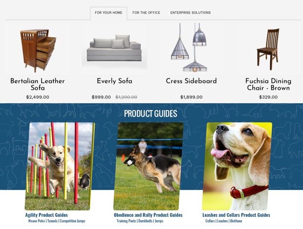
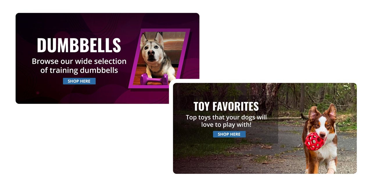
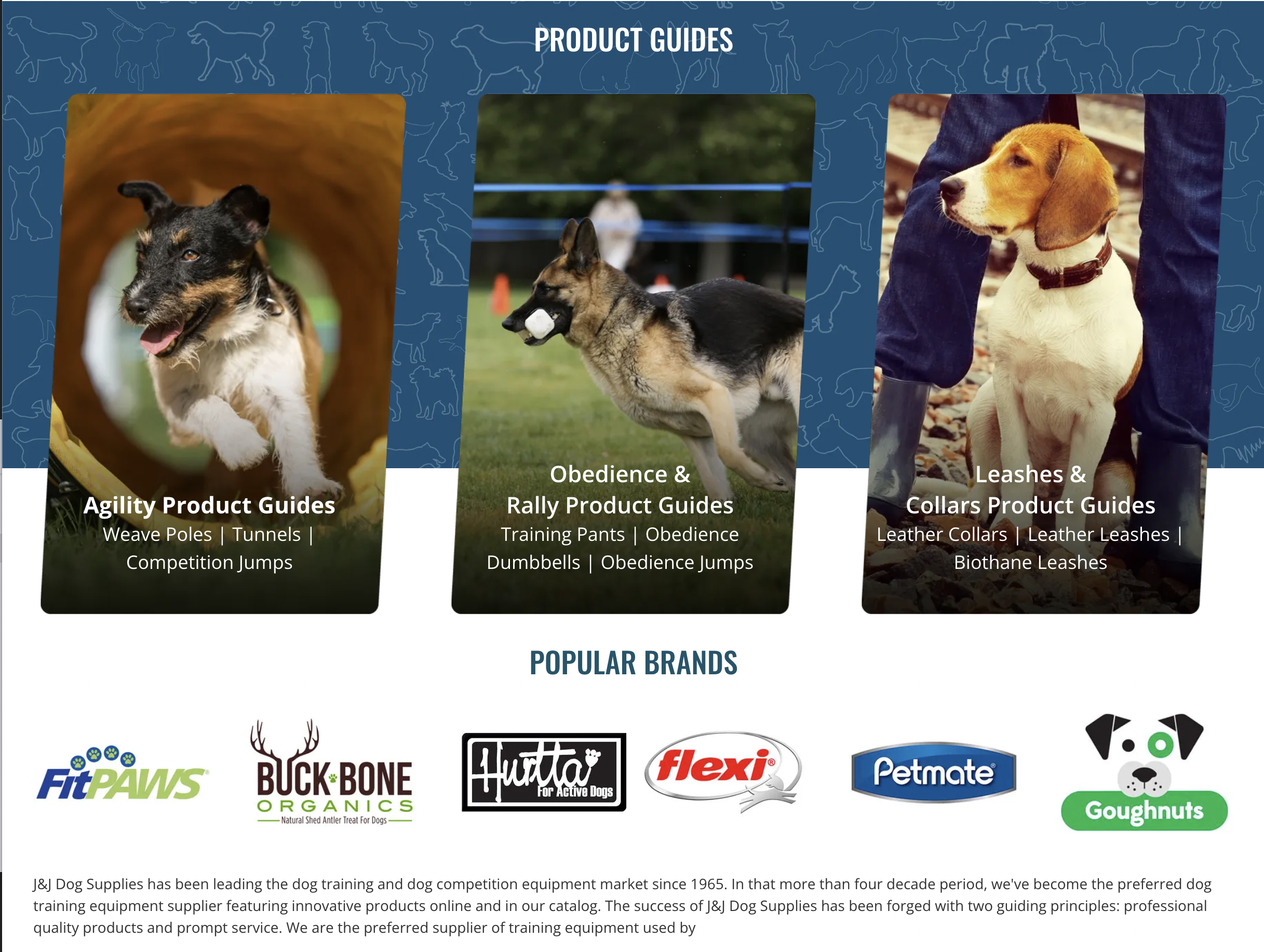
Additional Product Highlight Section / Product Guides Section
To enhance the homepage design, I implemented an additional tab section dedicated to highlighting best-selling items on the homepage as a valuable design strategy. It enhances user experience by providing a visually appealing and easily accessible way to discover popular products. Furthermore, I incorporated SEO-optimized product guides beneath the tab section to improve website visibility in search engine rankings and drive organic traffic. Overall, these strategic additions have lead to increased engagement, conversion rates, and credibility for the website.
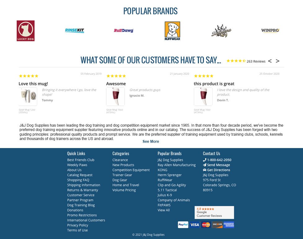
Footer / Popular Brands / Customer Reviews / Site Links
The new design features a dedicated brand section to showcase top brands and partnerships with manufacturers. A carousel feature displays positive customer reviews, providing insights for informed purchasing decisions. The bottom section integrates the footer, ensuring all necessary information is accessible without compromising the website's aesthetic appeal. This design enhances the overall user experience and showcases the company's commitment to quality and reliability.
Iterate and Improve
The foundation of the new design was agreed upon and the design was ready for testing and iteration. I built the new design in Shogun and the team began to to make further edits and iterations based on feedback.
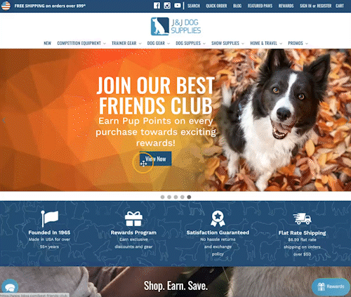
Call to Action Hero/header section
The top area was updated to include a search area with quick links to access more popular areas of the website. Just below the category links were updated to include the new hierarchy for redesigned information architecture. The banners were edited to include Open Sans text and a button to improve SEO while removing the elements from the image.
Below the hero, we bumped up the benefits section to better divide the imagery and make it easier to digest for the user.
Below the fold section
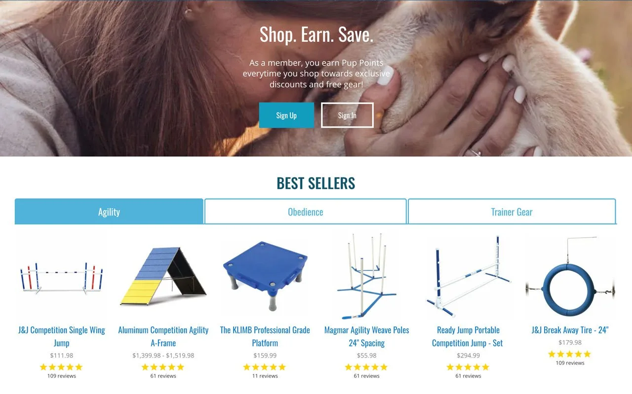
We updated the top section for the rewards program to entice users to exchange their emails for rewards like discounts and free products. We chose a parallax function for the image to make it compelling and interesting.
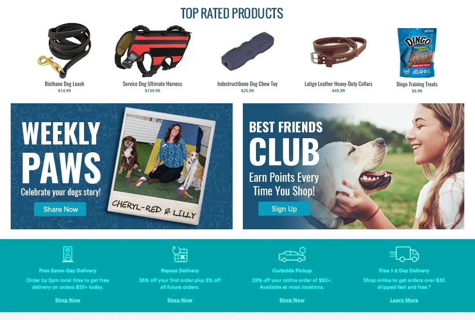
Here we swapped in a “Best Sellers” section where we highlighted our top sellers from the main categories on our website.
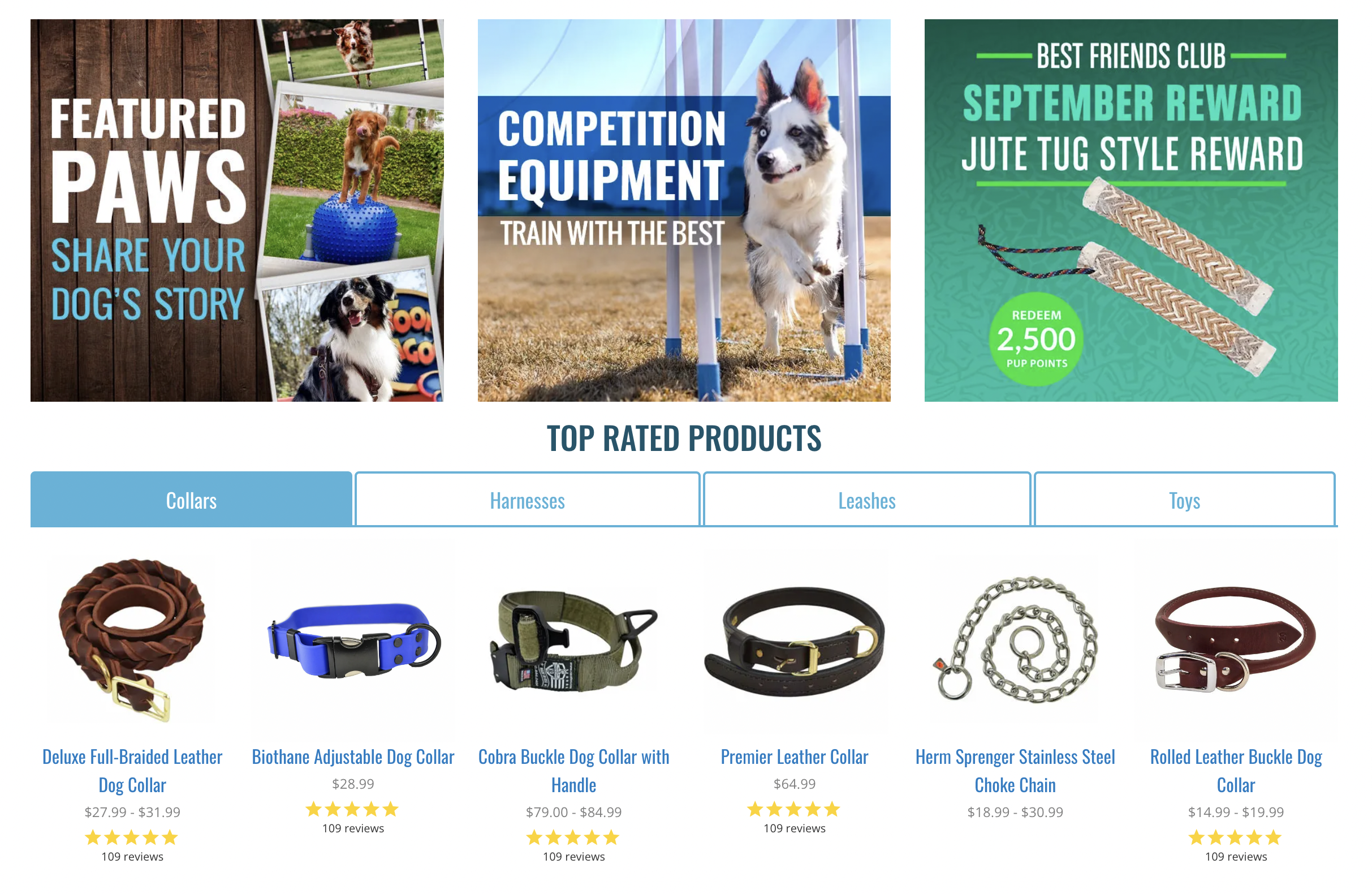
Highlighting Site Links
Through strategic design edits and thoughtful placement of graphics, we have moved the customer engagement programs section to this area of the homepage. The relocation of the Weekly Paws and Best Friends Club graphics ensures their increased visibility, while the inclusion of a "Top Rated" section highlights our most highly regarded products. These enhancements are intended to captivate viewers' interest and encourage their active involvement with our brand.
Advertisement Callout / Brands highlighted
Within this section, I have taken the initiative to update the imagery for the brand guides and introduce a rotating carousel for the brand logos. These enhancements aim to enhance visual appeal, convey movement, and establish a stronger connection with the target audience.
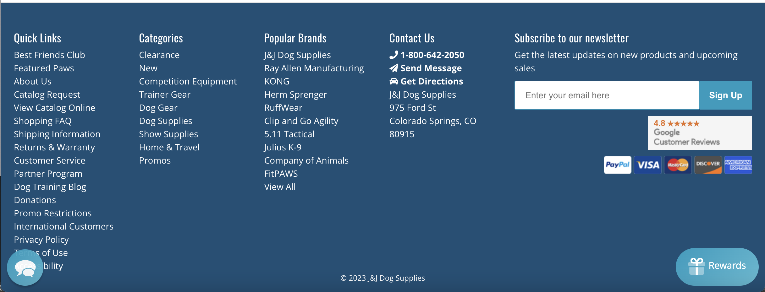
Footer / Important Information / Site Links
The site map was finalized and we updated the footer links to cover a robust section of options on the website.

Lead tool #1
Sign-Up offers
The Best Friends Club is a rewards program our team designed to help draw a visitor further into the brand of J&J Dog and it is an ideal opportunity to prompt the visitor to share their contact details in exchange for a 10% discount and as an informational resource.
Lead tool #2
Contact Us option
The marketing team created a Contact Us function built into the website to contact the team directly which ads a personal access point for potential or active customers to track orders or ask questions.
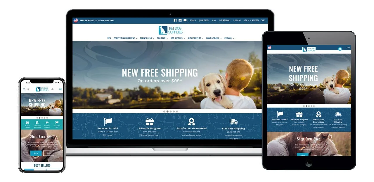
Formatted for all screens
Responsive design
The final design for this project was to make sure it looked good on all screens. When I used the Shogun Page builder I was able to maximize the design for multiple screens.