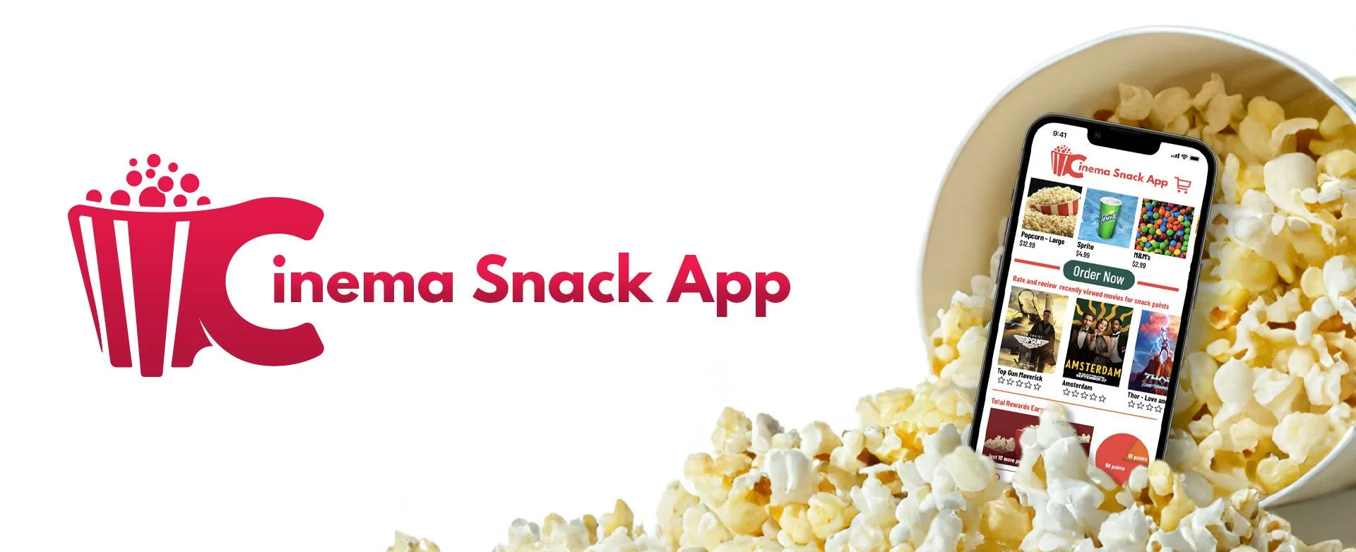
Cinema Snack App
UX Design for ordering snacks in advance
Project Overview
The Product
UX design case study of a mobile application for ordering snacks, rating movie trailers, and earning rewards.
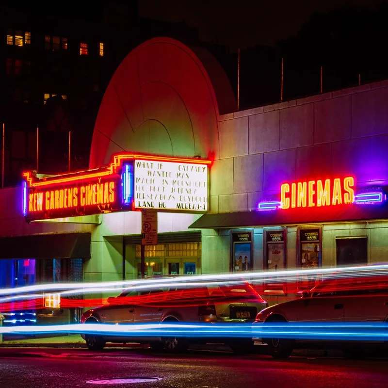
The Problem
Busy moviegoers may not have enough time to get to the theater and order snacks before the show starts. Long lines at the snack counter can make this take even longer.
The Idea
Design a website for moviegoers that allows the ability to easily and quickly order and pick up snacks in advance of their movie showtime.
My Role
UX designer designing the app Cinema Snack App from conception to delivery.
My Responsibilities
Conducting interviews, paper and digital wireframing, low and high-fidelity prototyping, conducting usability studies, accounting for accessibility, and iterating on designs.
User Research: Summary
Analysis
I conducted interviews and created empathy maps to understand the users I’m designing for and their needs. A primary user group identified through research was young adults and older working adults with extra spending money who don’t have time to get snacks before arriving at the movie theater. This user group confirmed initial assumptions about regular moviegoers, but research also revealed that time was not the only factor limiting users from ordering snacks ahead of time. Other user problems included a lack of incentives to order snacks and a lack of apps offering a pre-order for snacks option.
User Research: Pain Points
Time
Often adults and young adults are too busy to have time to get snacks just before a movie
Inconvenience
Often when the consumer arrives at the theater there is a line for snacks
Information Architecture
Some apps have a heavy focus on the movies themselves and not any direction to ordering snacks

Personas
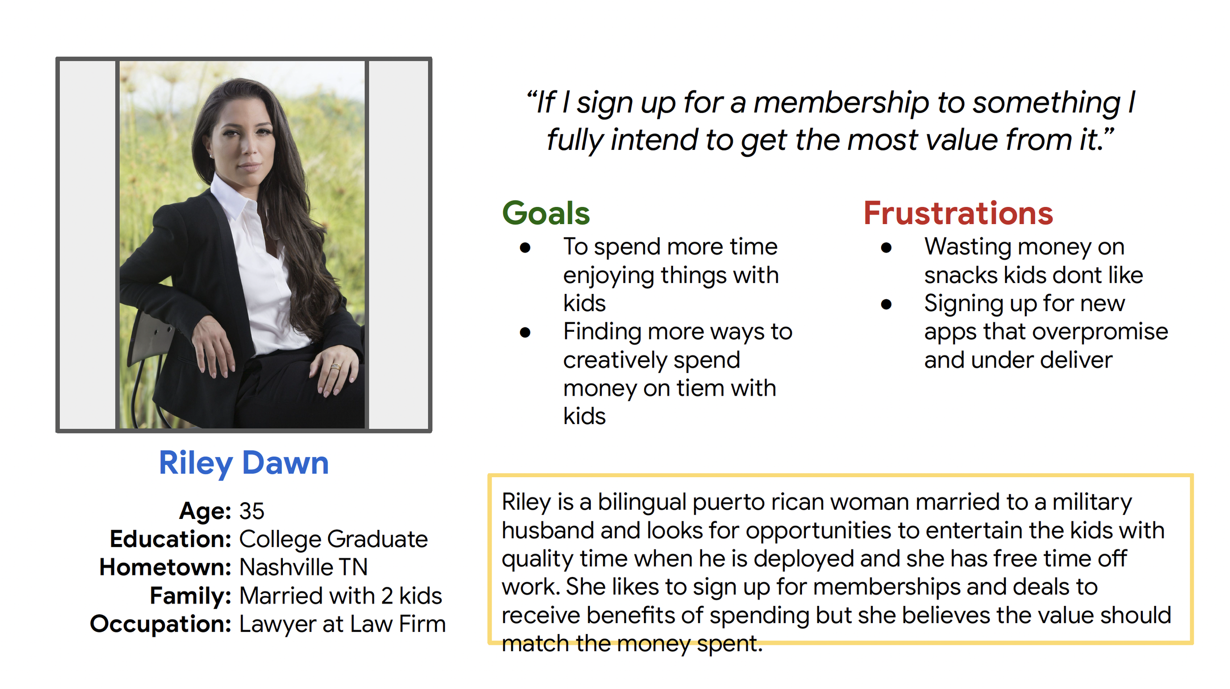
Persona: Riley Dawn
Problem Statement: Riley is a working adult who needs to find entertainment for her and her kids with cost benefits to save money.
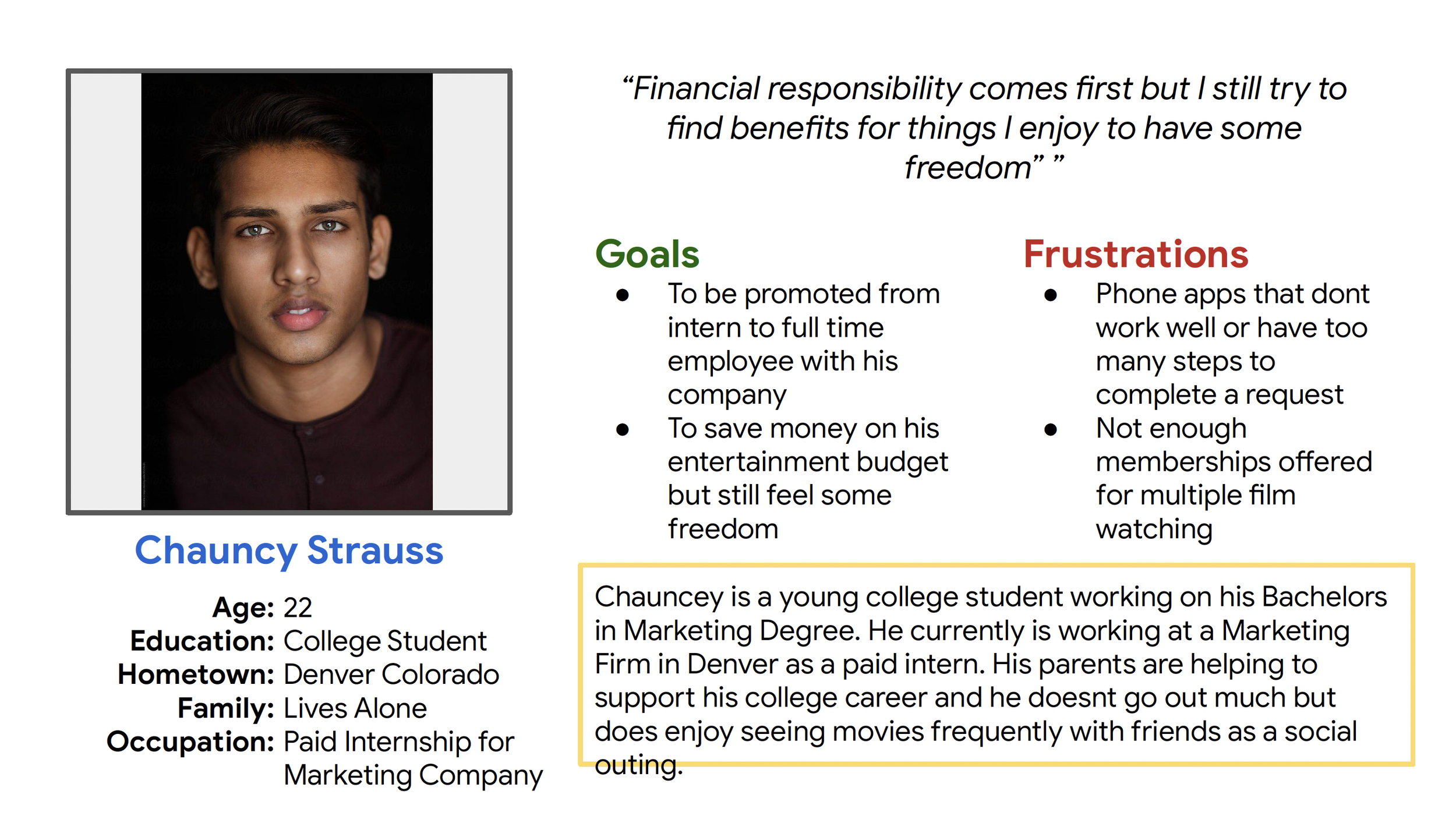
Persona: Chauncy Strauss
Problem Statement: Chauncy is a college student who would like to save money while going to see the movies with his friends.
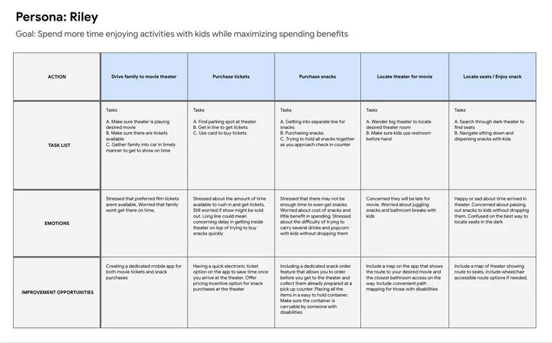
User Journey Map
Mapping Riley’s user journey revealed how helpful it would be for users to have access to a dedicated Cinema Snack App.

Paper Wireframes
I took time to draw up 5 different iteration options for each screen of the app on my tablet to ensure that the elements that made it to digital wireframes would be well-suited to address user pain points. I prioritized an easy process and clear selections to help users understand and save time.
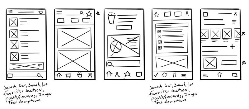
Digital Wireframes
As the initial design phase continued, I made sure to base screen designs on feedback and findings from the user research.

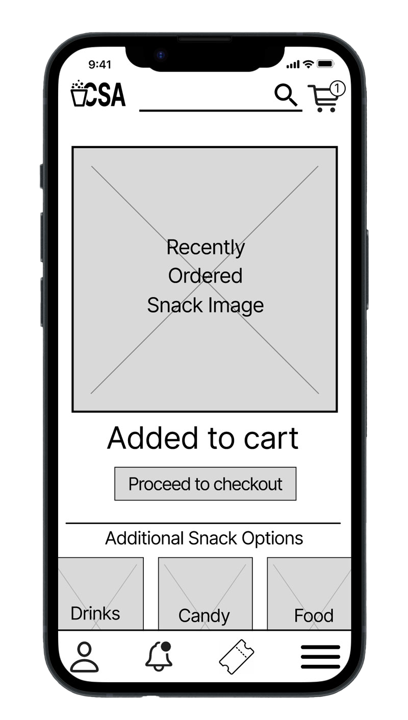
This button towards the top makes it easier to select a quick ordering option from a previous order

This search bar provided an easy way for users to search for their favorite snack
Keeping navigation easy was a goal to help users understand and use the app with familiarity among other apps
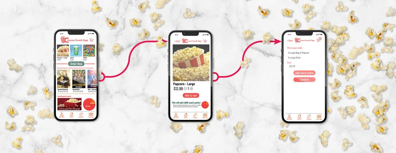
This screen provided the visible order option to help users understand their step in the process
Low Fidelity Prototype
Using the completed set of digital wireframes, I created a low-fidelity prototype. The primary user flow I connected with was building and ordering a pizza, so the prototype could be used in a usability study. View the Cinema Snack App low-fidelity prototype
Usability Study: Findings
Round 1 Findings
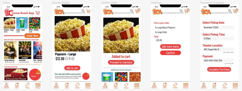
There was no “New Order” Option, only the ability to re-order from a previous order.
There was no “review your order” screen before completing your order.
There was no “Confirmation Screen” to 3 confirm the order when it was complete.
Round 2 Findings
The Main popcorn button did not work
No confirmation screen for the Sprite order
No return home button on everypage
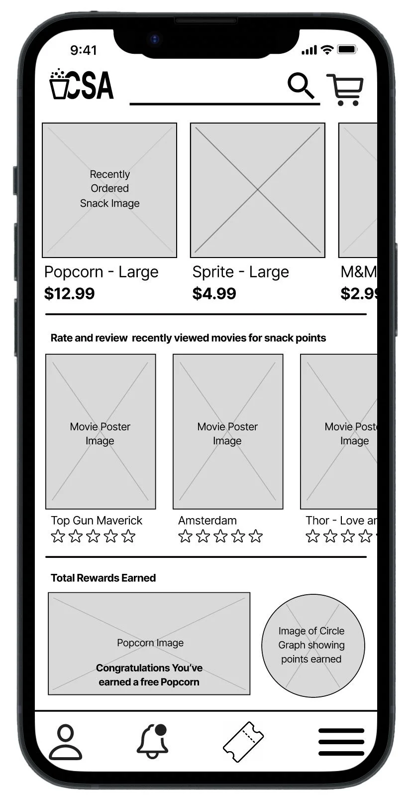
Mockups
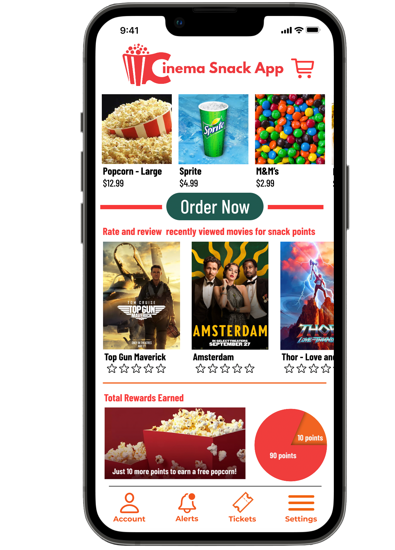
Early designs were created with basic functions in mind. After the usability studies, I added larger text and a color palette to make the app pop. I also moved around the elements to help the user more easily navigate the app.
Before usability study
After usability study
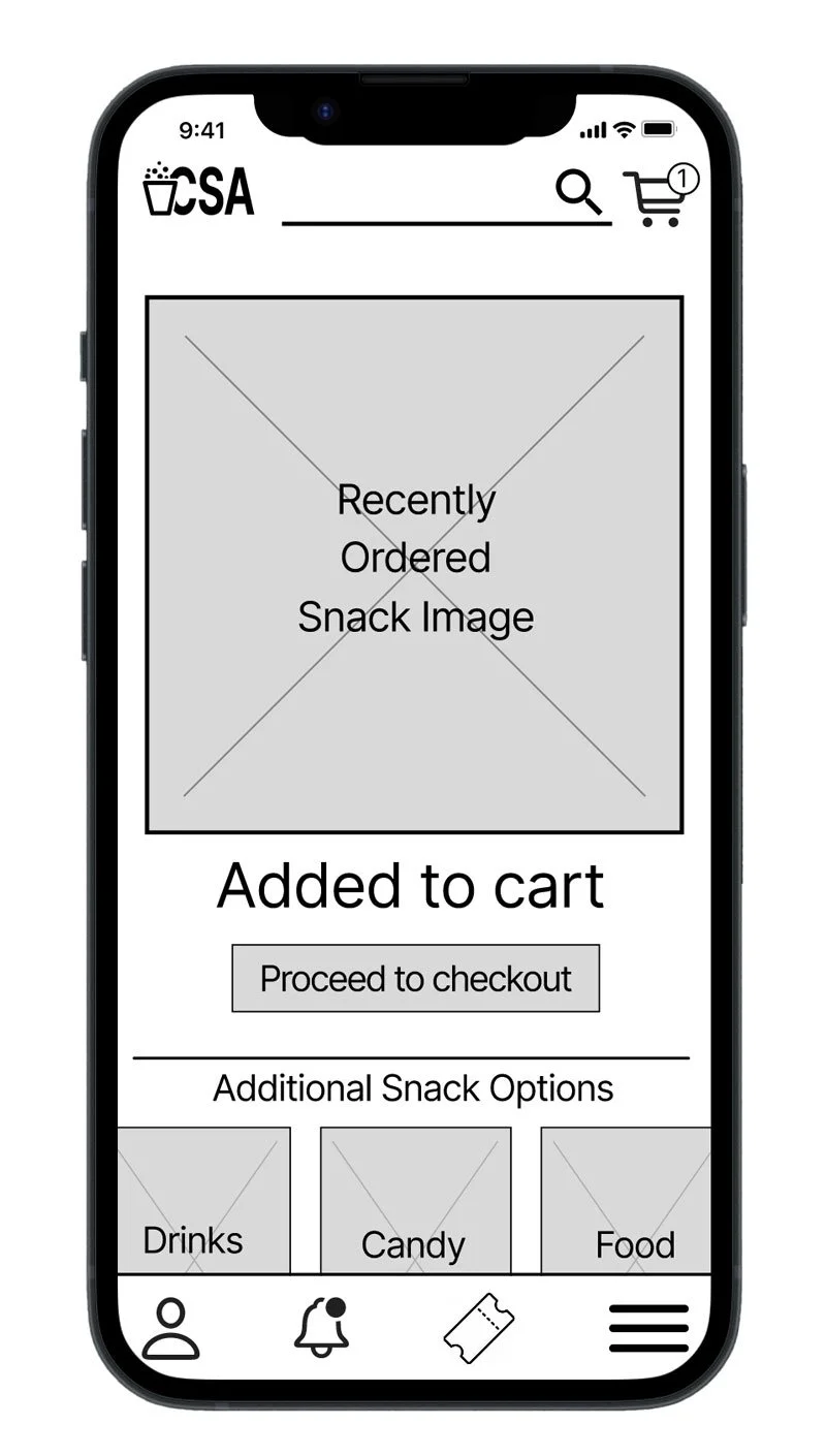
Mockups
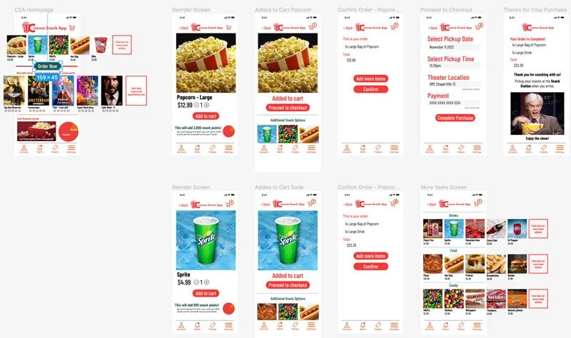
The second usability study revealed a lack of options with checkout. Missing confirmation screens, broken links and there was no back button. After the 2nd usability study, I corrected the broken popcorn link. Added a back button, Added confirmation screens for the complete order, and added Sprite. I also changed the color of the order button to give it a more stand out look and I added scrolling functions to give this app a more real to life style/function.
Before usability study 2
After usability study 2
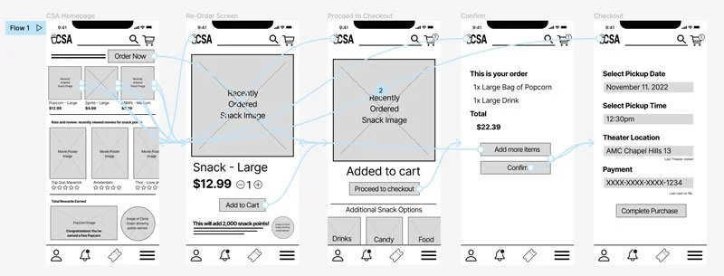
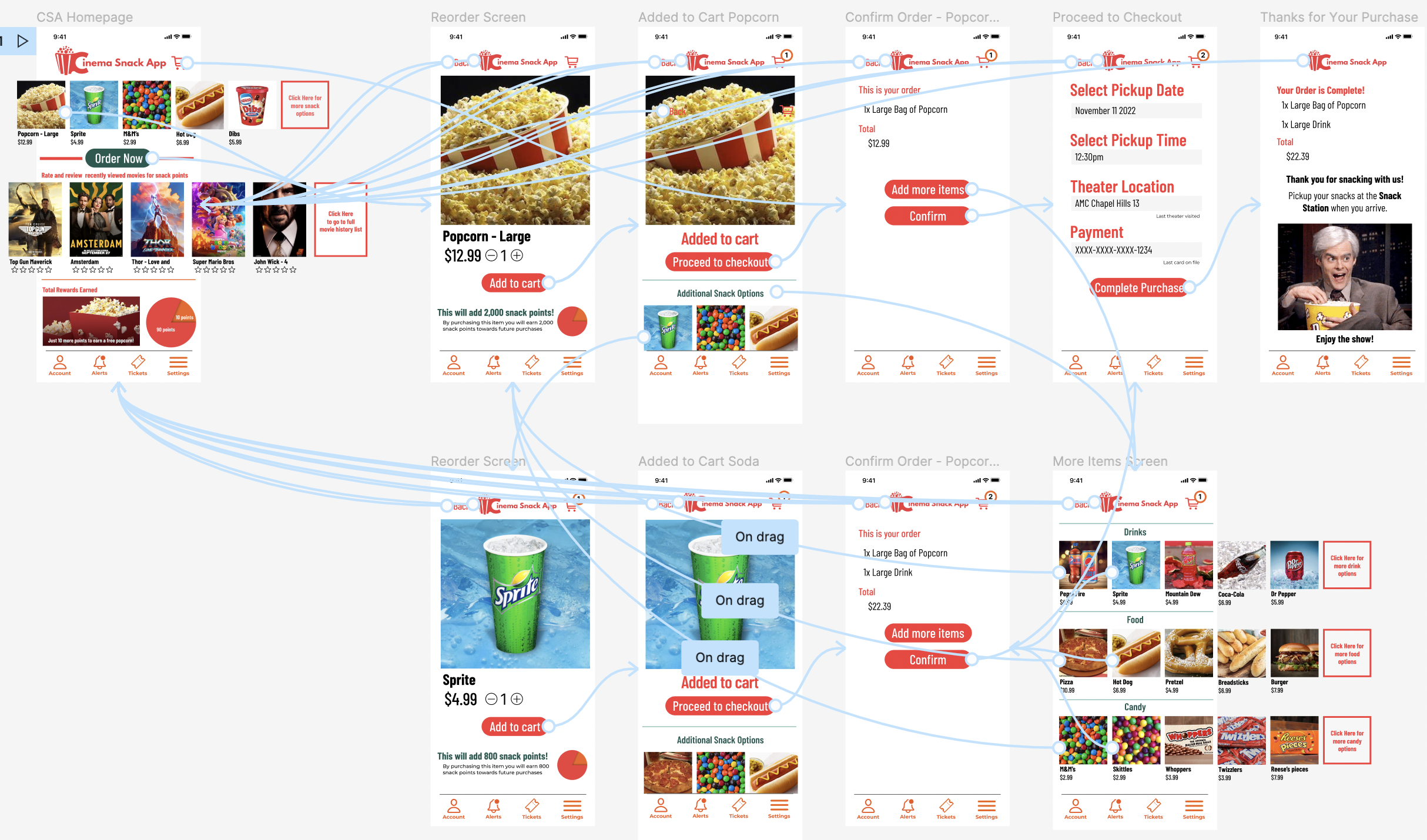
High Fidelity Prototype
The final high-fidelity prototype presented cleaner user flows for making a snack order and completing checkout. View the Cinema Snack App high-fidelity prototype.
Accessibility Considerations
Will provide access to users who are vision impaired by having the engineers add alt text to images for screen readers.
Created icons for main functions to help make navigation easier.
Used detailed imagery for snacks to help all users better understand the products.
Takeaways
The Cinema Snack App makes users feel like the developers of the app are really striving to meet the needs of the users. One quote from peer feedback: “This app was very easy to navigate and super helpful for ordering snacks at the movie theater! I can’t wait to get more points for new snacks and never be late to my favorite movies again!”
Impact:
While designing the Cinema Snack App, I learned that even though I had my ideas of what makes a well-built app I really had no idea what I could be missing or what could help without utilizing user feedback. Interviewing and learning perspectives from potential users has been a game changer in my design process.
What I learned:
Next Steps
Conduct another round of usability studies to validate whether the pain points users experienced have been effectively addressed. Also to learn if there are any more areas in which the app can be more refined and improved for a smoother flow and feel.
Conduct more user research with the feedback gathered and a final comparison to other apps to determine if there are any new areas of need.